DEADLINES

A2 DEADLINES

Research and Planning/Hand in Folder: November 4th

Finished Music Video: December 16th

Finished Website/CD Cover/Evaluation/Blog:13th January

Wednesday, 15 December 2010

C.D cover ideas


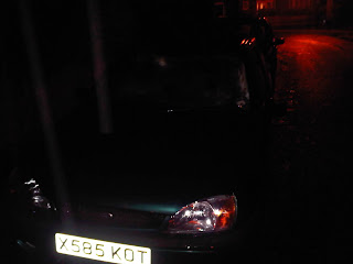
These are two still shots that we took during the filming of the peformance scene for our music video. We intend to use an image similar to these two for the back of our C.D cover. We will edit the pictures, maybe blacking them out a little and making it blurier around the edges.

Tuesday, 14 December 2010

CD Digipak

With our digipak and website deadline also coming up, we are working on these as we speak, this is what we have roughly produced for our CD front cover so far:

Filming Progress

We are now fast approaching our deadline and are coming to the business end of our music video!


We have just about done all of our 
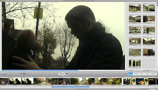
filming with perhaps one more shoot needed and we are left with editing our video, here are a few screenshots of our recent progress:


Friday, 26 November 2010

Filming

We have now filmed and edited some of our video and we are pleased with the outcome so far! we are currently preparing for our next shoot which will hopefully be at the end of the week! We are also organizing our performance scene to shoot in the upcoming week!

Music Video Inspiration/Ideas


This; an iconic video by The Verve, inspired us for the opening of our music video. In this video the performer has his head in "the clouds" almost and therefore bumps into people recklessly. In our own video, at the beginning; we aim to achieve a similar thing but with just one 'bump' and not as many. We aim to do this because our character will be fed up with arguing with his bear and his head will be a bit all over the place so therefore wont be concentrating on what he is doing!

Jordan Rowson
Jordon Waring


Friday, 19 November 2010

Website Ideas


This is a image we created during our last Media lesson. We aim to use the bear as our website layout and have navigation links from it. We edited this photo on Photoshop and aim to keep doing work on it in the upcoming lessons.

CD COVER IDEAS!


This is an existing album cover from the arctic monkeys that we may take some ideas from. The font is something that we are going to use throughout our production, on our website and C.D cover.

Wednesday, 10 November 2010

Website Design

We have started designing our website, experimenting and familiarizing our selfs with the Iweb software. Here is a sketch we drew in lesson that we are going to upload and play around with an maybe upload to our website.

Jordan Rowson
Jordan Waring

Friday, 5 November 2010

MARK RONSON CASE STUDY


The style in this video conforms with the style inherited on Ronson's album artwork and website. It has a recurrent 80's theme with the hairstyles, costumes, strobe lighting and instruments all included being conventional with that expected in the 80's decade. The video often looks amateurish but this could be because they are trying to be like the 80's where effects are often cheesy and look amateurish.

MARK RONSON CASE STUDY


The website conforms with Ronson's image on his album album cover Record Collection. There are lots of records/vinyls on both sides which is also apparent on the album cover. The same colours from the artwork are also evident. these are all examples of synergy as he is using the same style and image across different forms of promotion. The Mark Ronson website has the main functions that you would expect from a music artist website.


MARK RONSON CASE STUDY


There are three layers to this artwork, one showing a picture of Ronson himself, another of his name and one with a sort of red background. The album cover aims to reflect an old billboard. This may be because all the songs on the album are cover versions of older songs. He uses only 3 colours, red, white and blacks, which makes the cover quite plain and simple.  His music is quite old fashioned and retro which perhaps is why he has represented his album has sort of a 1960's billboard as if he is looking back rather than forward.


This artwork also inherits a similar style to the previous one. It has more colours and a variety of styles. Colours include pinks, blues blacks and a cream/beige in the background. His hairstyle and shades is very 80's which again could suggest he is inspired from past decades and tries to represent this style through his image. But the bottom right hand corner reflects a futuristic look so he is making references to not past and future. His face on this album cover is on numerous record sleeves. This album cover is made up of album covers from 80's artists. An example is Duran Duran's 'Rio' album cover which can be seen in the top left hand corner.

Wednesday, 3 November 2010

Location Photographs

These are some location photographs for the place we are aiming to shoot at soon. It is the place our lead character will live with his 'bear.' The photograph with the tele is where we are going to shoot the games scene I talked about in previous posts. We are also going to film a scene in the photographed car seen in this post. The gate is where he will walk through to enter the house at the beginning of our video.

Jordan Rowson
Jordon Waring
------------------

This is the weather forcast for the next 5 days for the area in which we plan to shoot in. Sunday looks to be the best day to shoot one of our out door scene. We aimed to do a 'walk in the park' scene so we need a dry day to shoot this.

Jordon Waring

Monday, 1 November 2010

This is a drawing I sketched on a recee sheet for one of our chosen locations. The location is well lit and has no trip or fire hazards and no potential for street crime, and we will not need any extra lighting. We aim to shoot a scene where the lead character is gaming and neglected his teddy bear in which the bear gets unhappy with! The location is one of our bedrooms and we think it will work well as it is a typical teenagers bedroom and this is what we need to shoot a 'game' scene. There is no background sound so our shoot won't be affected! We aim to add indie posters perhaps of our chosen band to make the room more relevant to our genre.

Jordan Rowson

Saturday, 30 October 2010

Below is an example artwork for our chosen artist. It is for one of their singles which is called "fluorescent adolescent." When I designed the template for our digipak, I had this particular artwork in mind as it as a convention example of our chosen band and I wanted to conform with the conventions. The font is unique and quite famously iconic to the band now and I tried to reflect this in the design of our own artwork!

Jordan Rowson
------------------

Analysing Former Videos

This is an exercise we did in class recently. It allowed us to critically analyse the previous years’ music videos’ giving them a mark and level we felt they deserved according to the exam board criteria. It was a good exercise as it allowed us to look at the strengths and weaknesses of previous videos and to interpret what was good and bad into our own planning ideas! Below is the sheet we filled out:


Jordan Rowson
Jordon Waring

CD Digipak Ideas


Here are a couple of examples of the artwork I was talking about in the previous post. These are good examples we have looked at to gain ideas for own artwork and show how this idea is effective if used correctly!
Jordan Rowson

Kanye West uses a Bear as a sort of mascot for himself, almost like a symbol. He uses the bear on the front of every album cover, and whilst we are only producing a video for a single song maybe the bear could be used as a running theme throughout our project, reoccurring on the website as well as the digipack and in the video.
Jordon Waring

Digipak Design Template

These are some initial design sketches I have constructed for our CD digipak. They include all the typical conventions such as the song title, band name, intuitional logos and appropriate iconography. Due to our video including a ‘teddy bear’ we think it would be a good idea to use this in our CD covers as it would be a good way of appealing our product. We gained inspiration from Kanye West who was had bears on his artwork in the past (I will post an example picture up soon.) Other features include images of the band performing which is also an effective way of appealing!
Jordan Rowson

Friday, 29 October 2010

C.D DIGIPAK RESEARCH!


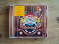
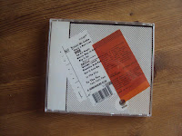
The zutons album cover is an interesting artistic piece. it has extreamly bright colours on it and has a running theme throught. They have used flames on the front, back and insert. The bright colours fits in with the indie genre and is something we may aim to do in with our own digipack.

C.D DIGIPAK RESEARCH!


The layout of this digipak is quite artistic. They've aimed to make something that may just look like mess be arty. It keeps in line with Radioheads clean cut image. We may aim to be quite arty with our own digipak. It may not be appropriate to the genre as there isnt any stereo typical indie conventions on this digipak.

Jordon Waring

C.D DIGIPAK REASERCH!


Whilst Kings of leon may not fully fit in with the indie genre, I felt that this C.D cover sufficiently matched that of other Indie bands. The front cover has been photoshopped and cut into 4 sections.  A picture of a band member has then been imposed onto a picture of a bird. This is appropriate for the genre as its quite unique and different. They use dark colours, greens and blacks. It sells the band as quite serious and creates a rock image. They have used a bird of pray instead of a nice, fluffy bird to coincide with the dark feel of the cover. The inside of C.D is completly plain, with an all green C.D and a black insert. This again is to portray the seriousness of the band.

Jordon Waring

CD DIGIPACK RESEARCH!


This digipack is that of the Kaiser chiefs album-employment. The front of the digipack has a black, rough look background with a yellow box in the middle of it. In the yellow box it says 'kaiser chiefs-employment. The name of this album reflects the bands image as they portray themselves as working class. In smaller print it says 'a box of tricks' and 'thrills for all'. This implies the great thrill people will experience from listening to this album. The layout is very simple, almost basic. this may reflect the bands laid back image. Inside the C.D a lot more is going on. The C.D its self is very brightly coloured, maybe going against the indie genre slightly as it tends to follow a darker pattern. It does, however, show the fun side of the band which they like to get acrosss in their image. The back of the C.D again returns to the basic layout. which little colour and style. The font used is also pretty basic and isn't fancy. Again this may reflect the laid back image of the band.

Jordon Waring

Tuesday, 26 October 2010


This is the homepage for ‘Tapes n’ Tapes’ is also one I personally like. Its colourful, has some appealing effects and goes a long way towards representing the bands style and image. The effect in the top right is effective and reminds me of the sixties with the variety of colour and the dress code inherited. This may be included because the band may have been inspired my sixties music and therefore have inherited a similar style in their own image. The site advertises the bands content really well. They promote their YouTube channel by including an embedded link of one of their videos, which is an effective way of doing so. Also towards the right hand side of the page there is a link to where you can purchase their latest music. The navigation fits in well with the background design and the font works well. 8/10
Jordan Rowson

Website Analysis


This is the homepage of the band ‘The Walkmen.’ The page is dominated by the one main image. It bears hardly any written text, with the exception the navigation menu, band title and a media player in the top left corner. The page is simply designed but is effective it what it achieves. I personally feel the band’s name could be enlarged to add more emphasis and that more external links could be added. Perhaps to sites such as YouTube; in order to promote their media products further. The media player is a good idea as it allows anyone to quickly listen to the band’s latest track without any difficulty. This a good use of new technology and is a nice feature. The page doesn’t offer too much on the bands image and has no real source of advertisement apart from the media player, so these are things I would address. 6/10
Jordan Rowson

This is a potential location for a scene we are looking to include in our music video. The scene will include a candlelight meal between the teddy bear and our lead character, which will show the positive side of their relationship.
Jordan Rowson

 
These are some ‘teddy bears’ we have found and in which we are considering using in our music video.  We gathered an idea during our pitch feedback which was that we could stitch or unstitch the chosen bear’s mouth in order to create the desired emotion. The one on the far left is the most likely option at the moment as it is most appropriately sized, but we are still looking at others!
Jordan Rowson
Jordon Waring

Friday, 22 October 2010

Test Shots


The hairstyle is quite messy and natural and has an 'everyday' look to it. This is because hairstyles in the indie genre are casual as the band members aim to fit into the audience that will be buying their music.
The style again is rather casual looking, with band members wearing jeans, shirts, polo tops and plimsolls. We are influenced by the genre in general and bands such as Kaiser Chiefs and the Arctic Monkeys themselves and have tried to interpret their image as well as all these other features in our Test Shot above

Jordan Rowson
Jordon Waring 

Contacting Domino


This is the email we sent to Artctic Monkey's record label 'Domino" in regards to permission about using our chosen song. We went into detail about our project, saying what we are required to do.

Jordon Waring & Jordan Rowson

Potential Location Ideas

Today we have decided on a few locations. The first location for  a particular scene will be in one of our bedrooms. This scene will include the main character playing on a games console, with the teddy bear looking on in disbelief. We have decided this is a good location as it reflects the sort of bedroom the audience would have. Our target audience can relate to this specific scene as they are likely to have games consoles themselves. In terms of background noise, there will be no disturbance from outside as it is an indoor location. We will make sure there is nobody in the house so that there is no noise or distractions. The lighting will come from the light switch as normal and if we need more we could use a plug-in torch if needed!

We will post pictures of this location soon!

Jordon Waring

Website Analysis/Research


This is the homepage of the band 'The Strokes.' This site is a personal favourite of mine as I am a big fan of the ‘stereo-like’ layout that is inherited. I think it's such a clever way of delivering a website as it doesn’t only conform to the genre of indie but conforms with music as a whole in general! There is not a lot of written text, with a main image bearing the bands name used instead. When moving your cursor over the volume knob at the bottom of the screen it moves with it as if you are turning the volume up! This is such a clever way method for navigation and goes a long way to appealing to the target audience. When browsing over the other buttons at the bottom, more links to pages are evident. My only criticisms of it are that the navigation doesn’t really stand out or appeal which a shame, considering the quality of the rest of the site. Also their is no apparent representation of the band’s style and image and also there is no external links to sites such as MySpace and Facebook- which are vital sources advertising  of advertisement in the modern music industry. 8/10

Jordan Rowson

Website Analysis/Research


This is the homepage of our chosen bands website. The website is relatively simple but is still effective and appeals well to its target audience; which is both genders around the ages of 16-30. The font used for the bands name is a trademark for the band as this style of writing is used consistently on other material such as their previous album covers/digipaks and promotional posters/flyers. This is  good way of advertising as people will automatically recognise the band just by looking at this icon/logo. Two simple colours in black and white are used throughout, which gets me thinking of a potential link to 'The Beatles' as they had a similar iconic layout on their album covers and promotional material which is renowned around the world. This could well have been thought about when designing the website as it is known 'The Beatles' were inspiration to this band when they were starting out and influenced the type of music they make. Evidence of new technology is apparent; with links to social networking sites 'Facebook' apparent at the top of the page. A link to their 'MySpace' page is also given which you would expect as this band has one of the most popular MySpace pages around. A further like to 'YouTube' is available, where they further have a popular 'channel' promoting all of their music. The written content includes information amount their performances, such as; reports on their recent performances, upcoming information about gigs and announcements about future events. This is conventional to the genre as a major part of indie bands' activity is performing live. This is a traditional thing as older music videos from the past show the featured band performing live to an enthusiastic crowd time and time again! It is also a good way of informing fans about their antics as well as advertising their upcoming shows. 7/10

Jordan Rowson 

Website Research


This is the homepage of UK artist 'M.I.A.' This is an original example and stands out exceptionally. Images are mainly used with the amount of text limited, which you'd expect on the homepage as its mainly about promoting and ultimately getting whoevers on the site to stay. The vast amount of bright colours helps appeal to her target audience which is perhaps teenage girls. The images of herself see her dressed in unigue fashion which personally makes me draw comparisons to the likes of Lady GaGa who also inherits a style and image that is similar to this. You could call this type of unsusal and perhaps a bit 'wacky' but it as hugely popular for modern artists. The big bold text is also appealing and therfore stands out more than a small bland font would. 7/10

Jordan Rowson

Example of Album Artwork


Above is the album artwork for one of our chosen band's previous albums. The album was released in the year of 2007. The band desired an actual real work of art for the cover image and got Liverpool based designers Juno, who did the artwork of their last album before this; to basically paint this house. I personally like this as i enjoy the artistic feel as well as the realism behind it. The picture of the house, which isn't terribly expensive again reflects the bands working class image as this is a conventional house from that particular social class. I've found that this patroticness is represented in their image consistently whilst i have been researching this band.

Jordan Rowson

Monday, 18 October 2010

Arctic Monkeys

This is the music video 'Fluorescent Adolescent' by the Arctic Monkeys. It was quite controversial when it was released around 3 years ago due to some of the violence in the content. But i find it quite an interesting watch as i don't take it too seriously! The locations used are conventionally urban and along with the actors dress code and other mise-en scene such as the cars used and so fourth, the video is a good reflection reflection of the bands working class background; which is one thing indie bands aim to achieve in their videos.

Jordan Rowson

Analysing of Music Videos


Above is a recce sheet i completed when analysing the video 'Young Love' by The Mystery Jets. The sheet enabled me to analyse various aspects of the video including, visual elements such as effects and costume as well as lyrical content (What can be heard) The video is mainly performance but does include some conceptual aspects, it falls well into the indie genre and is an interesting watch!

Here is the music video:


Jordan Rowson

Recee Sheet/Analysing Music Videos


Above is a recce sheet i completed when analysing the video 'Leave Before The Lights Come On' by our chosen band the Arctic Monkeys. The sheet is the same one as the Mystery Jets video analysed earlier in the blog. The video is solely narrative and features an established actor in 'Paddy Considine.' It was filmed in Sheffield, where the band are from which conforms with the convention of urban location associated with the indie genre.

Here is the music video:


Jordon Waring

Friday, 15 October 2010

Advanced Production: Pitch Assessment

1.       The song is called ‘Mardy Bum’ by the Arctic Monkeys and is 3 minutes exactly in length. It fits into the ‘indie’ genre and is mainly about relationship problems and how a partner is constantly ‘Mardy’ and argumentative. We chose it because it’s upbeat, catchy and has good lyrical content to produce a narrative/story so therefore we aim to make a narrative video for the song with some performance features also included!

2.       The age range associated with our genre is around 16-25 years, and is not gender specific. Topics such as love, relationships, breakups and other topics are demonstrated to appeal to the specific audience. The Arctic Monkeys’ music is targeted at more of a niche audience because their music isn’t always in charts or their videos on television. Aimed at working class people and no real ‘subculture’ as you will find a lot of people like the music as it is quite versatile. They became popular via the internet (MySpace) so the bulk of their advertising is largely on the World Wide Web.

3.       In the indie genre you usually expect to find a meaningful narrative which matches the lyrical content as well as a performance of some sort from the featured band or artist .The inclusion of instruments such as guitars, drums and microphones are also conventional along with close ups of members when performing /lip synching. Straight cuts and a variety of shots are used, lasting around 2-4 seconds on average. There is often a sense of ‘realism’ in indie videos in which the audience can relate to. The lighting is also quite conventional with black and white/dark lighting being used for effect and urban locations also used to reflect a working class backgrounds.

4.       The bands image is quite patriotic as they are seen with an England flag in some images and they include their Yorkshire dialect in their songs such as “rate.” Most of their press involvement is positive and on YouTube some of their songs have over ten million hits. Their dress code is casual with shirts, jeans and plimsolls worn- a style we intend to inherit in our production.  You could relate their image to other bands in the indie genre such as the ‘Kaiser Chiefs.’

5.       The theme of the song is relationship problems and instead of playing on the normal boring ‘boy and girl’ problems we aim to be original and instead go with boy and teddy bear problems. The idea of the narrative is to follow the boy and teddy bear around and show the contrasting sides of their relationship- which is what the song is about!
For example for the lyric “cuddles in the kitchen” we will make the sound parallel to what is shown on screen which will reflect the good side of their relationship! We are going to cut from narrative to performance throughout the video at relevant points to mix things up and make sure the content is not repetitive and boring. We aim to use variation of effects, camerawork and good editing to make the production as good as possible.


This is an activity we completed for the preperation of our pitch. It includes 5 sections and was a good research exercise!

Jordan Rowson
Jordon Waring

Friday, 8 October 2010

Mood board for genre


This is a mood board for the chosen genre 'indie.' It includes some images and annotations which i feel are a good generalisation of the genre! This was an interesting research task which allowed me to gather a variety of information for my planning of the music video.

Jordan Rowson

PITCH


We felt the pitch went reasonably well and that we covered the 5 research aspects in good detail and gave a good indication of what to expect within the genre of music we are choosing to do. We communicated well with the audience, speaking loud and clear. And when we recieved feedback there were a lot of positive comments. In terms of improvements (if we had to do it again) we would go more in depth about our personal ideas for the video as we didn't elaborate an awful lot so this would be an aspect we will improve on but otherwise i feel our pitch was a success.

Jordan Rowson

Tuesday, 28 September 2010

Song Lyrics/Discussion of ideas


Here is the song lyrics for our song 'Mardy Bum' by the Arctic Monkeys
We identified where each verse and chorus started/ended to prepare for the production of our step outline grid which will include our most up to date ideas. This exercise also allowed us to develop ideas and is a good contribution to our research and planning!

Jordan Rowson